
Thursday, 10 February 2011


Chase&&Status Interview for Gigwise: http://www.gigwise.com/features/60933/Chase-&-Status-Interview

Did you have a certain sound that you wanted to achieve with this album? How does it differ from ‘More Than A lot’?“We didn’t really have a certain sound. I defiantly think that we wanted to expand on the vocals used on this album. We enjoyed working with Plan B on the last album and from spending five or six years just producing and making music that was our first real experience of working with another artist.”
Chase & Status made a huge impact back in 2008 with their debut 'More Than Alot'. In a matter of months, the London duo took dubstep from the UK's underground scene to the radio mainstream.
You’ve got some big acts on this album; Tinie Tempah, Dizzie Rascal and White Lies.“Yeah as the last album did well and we are now signed to a major record label so we’ve been able to make more links in the music industry which has given us more choice in who we want to work with. We sat down and made a list of who we wanted to appear on the album and covered everyone and were quite fortunate to get most of the people we wanted.”
Do you get a lot of people saying your music has crossed over to being more mainstream? Or is that just a natural progression as you get more successful?
“It’s weird that people are so keen to define what a band are. I think artists just make music and it is what it is, if more people listen to it then I guess you become more cross-over and if day time radio play it then your more mainstream. We hope that we haven’t lost our integrity by being mainstream. Songs like ‘End Credits’, when we wrote that everyone seemed to love it and kept saying it could do really well. I was just thinking this can’t be right this song has the messiest hard core drum section in it. I hope people don’t think we’ve had to numb down the sound for this album.”
What do you make of the current dubstep scene in the UK at the moment?
“It seems to be the flavour of the day at the moment. If think it’s quite dangerous when that happens to a scene because if it doesn’t last then it can seem like it implodes. UK garage that happened to and grime. Everybody’s talking about dubstep becoming mainstream and the big sound of America, I really don’t think it will. Dubstep is dubstep for a reason because it’s underground, grimy and minimal, and it’s not meant to be big songs. If it started to become that, with lots of big choruses, then it wouldn’t be dubstep anymore people would move away from it and it wouldn’t be the same scene anymore.”
Do you both put a lot of effort and backing into the live shows?“We lost a lot of money at the beginning because we wanted our shows to be really great. We saw it as a long term investment so we didn’t really care if we didn’t make that much money on the first few tours, we wanted to do something that people talked about and that would build us a reputation. Our tours are like one big family we’re surrounded by the best musicians and singers around at the moment.”
Photoshoot inspiration -Lindsy Lohan


I really love this beautiful photoshot of Lindsy Lohan, its so fresh and natural, the colours are very youthful and each image radiates in its own way- I really like how she looks like 'the girl next door' althougth these pictures are very different to what i was thinking of using, i think these work very well and gave me abit of inspiration (:
Music magazine contents pages
 This is a rock and roll contents page, this contains some of the connotations im looking for within my Drum and bass magazine, such as the dark colors and bold fonts.
This is the EMA Contents page, it reminds me of festivals.

this looks fairly youthful to me, I think it would attract late teens, university students.
Wednesday, 9 February 2011
Artist that inspire me

Banksy, Jamie Hewlett, Obey and Diam.
These are some of my favorie artists, I'm going to do my own intepritations of their work and use it in my own work, I want some typical graffiti to run through my cover page, contents and main aritcle, I think it would herlp to show that the pages are linked toghether and build a good relationship between each part because i can then use a colour scheme that fits all aspects of the magazne.
Graffiti is also a very good way to grab the youths eye because it is very much part of youth culture, and thought of steriotypically urban.

Names for my Magazine
- SMILE
- WARNING**
-HEADSUP
-CHANCE IT
- WASTED
- CAUSE FOR CONCERN**
My favorite is eithat 'Cause for Concern' or 'Warning', They have a real daner appeal to them, it sounds unsafe and outragous. I think these names could really attract the right audience, escpecially if it in big black capital fonts.
***
I've been looking for some distorted fonts on 'www.dafont.com' which work really well with my ideas; I tested a few with 'Warning'

I have decided I really like the name warning as my title, it is a powerful word and I think it can gain the attention for the correct audience, it also looks very stricking and its very volitial with effects; my favorite font is number 3.
Reader Profile // Mood Board
I made this on PhotoShop (:

Biased upon my results from the questionnaire i had made through http://www.surveymonkey.com/ and sent out through my facebook profile I have found out who my target audience is going to be, what they expect to see and how i am meant to aim my magazine at them.
overall, 16 people took my questionnaire, 68% females, 32.3% males. 68% were between the age of 17-21, 25% were 12-16 and only 6.3% was aged 27+; this shows that most were students/ late teens, they don't have a lot of income who tend to either work part-time jobs or are being supported by parents, they are very much at the forefront of anything that's in fashion but are also stereotyped to be outrageous and somewhat wild.
This is also shown within the choice of music that has been shown through the questionnaire, 43.8% of people choose drum and bass/dubstep and 37.5% choose rock. most attend gigs/ festivals on a regular basis, these mostly include rock and drum and bass/dubstep also being the most popular.
I also wanted to find out how people purchase their music, amazingly, 100% of the people that answered said they downloaded their music but 53.3% also still buy C.Ds.
finally i wanted to know my audiences initial reaction to what attracts them to buy magazines, I found that 53.3% saw 'freebies' as a way to grab their attention also content plays just as much as a reason for buying it. but surprisingly colours/ images only getting 20% of the vote were seen to be least important.
This shows a lot about who I am going to be aiming my magazine at:
Females between the age of 17-21, students with low income possibly working-part time jobs or supported by parents, so it needs to price it cheaply.
Their chosen choice for music would be drum and bass/dubstep or rock, they regularly attend music festivals and gigs these include reggae, drum and bass and also rock events. They download their music from sites such as youtube, limewire ect, both legally and illegally. when buying a magazine the content and freebies matter the most, colours and images are
important but not so much.
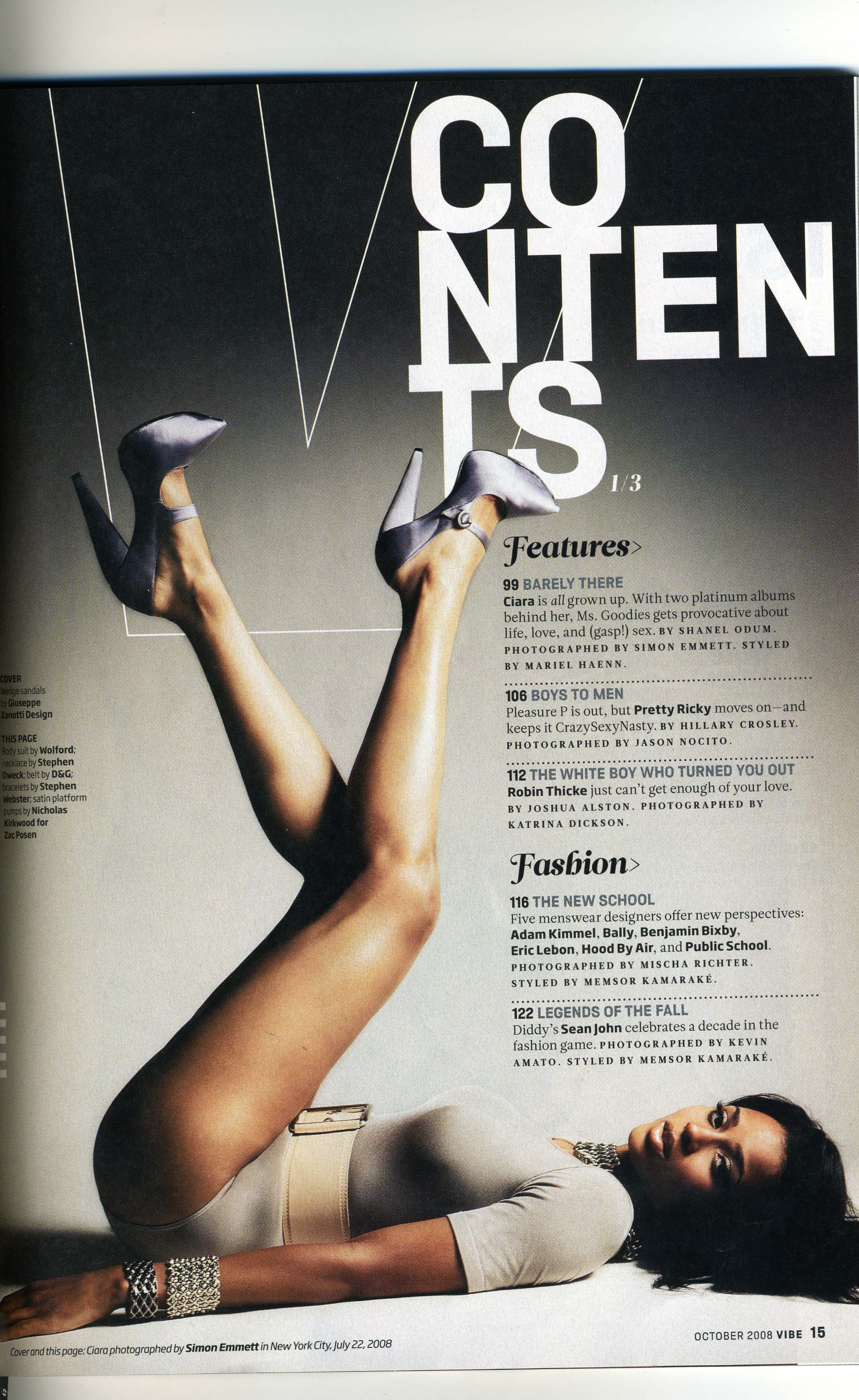
The Libertines contents page

The contents page has been split into two, on the top half is the main image and on the bottom half is the actual contents, between the two halfs is a pull quote, this has been used to not only divide the page but also join them up, it shows a clear divide between both parts of the page yet the quote invites the reader to find out ‘What’s inside your Libs mag’
The main image has been positioned on the top half of the page, it shows the bands popularity, and also the controversy surrounding the them- its a powerful image, it’s taken from on the stage, the main focus is Pete Doherty and Carl barrett who are in the middle of a gig a crowd full of young adults and early 20’s. Pete and Carl are central and they are about to kiss on stage, guitars in hand.
The font used on headings is the same running through the whole page, except on the top half the font is white and also bigger where as on the bottom half, the text is black and smaller, underneath each heading on the bottom of the contents page, a different font has been used to draw attention to other peices of information, this has been written in ‘Arial’ in quite a small size, although it isn’t in bold and it isn’t as bigger as other fonts on the page it still draws the reader into it.
Although the contents page hasn’t strictly followed the same principles as the cover with the colours and fonts, it has carried on the theme of English rock and roll/indie, by showing the atmosphere in the main image and the individuality and outrageousness in the genre.
The Libertines cover page
The first magazine cover I am going to analysis is 'The libertines' this magazine is aimed at older teenagers and people in their 20's, University students who enjoy going to gigs. The genre of this music magazine is british rock and roll/ indie, this is the theme and its has been represented well throughout the cover, the use of colours and text show this.
The first thing the audience would notice is the pull quote, its been positioned at the bottom half of the page it stands out well against the background because of the use of bold colours that boarder the quote. The colours used represent the Union Jack, red, white and blue; these colours have been used fairly excessivly on the cover, which relate back to the theme of British rock and roll/indie.
The main image is of the band the libertines themself, this image has been styled well, the two main artists, Pete Doherty and Carl Barat are closest to the pull quote, their image clear and sharper compared to the other two who are more blurry and towards the back of the image. I background of the main image has carried on the theme of red, white and blue which reflect well off Pete’s tshirt and the pull quote.
The mastehead, is completly undisturbed. its very clear for the audience to see which magazine they are looking for, its in black, bold capitals the backing is just pure white. The masthead is unrelated to the main image or the rest of the cover, other than the name, it doesn’t carry on the british rock and roll theme in any way.

Experimenting with Photoshop

Anaylsis of a music magazine 2
The magazine, 'Atmosphere' is genred as Drum and bass, this is shown by the Free Cd by DJ Ray Keith that is being given away, and by the cells down the right handed side. This helps to attract the right audience to the magazine. Drum and bass media's aren't so popular, compared to R'n'B and Rap, so targeting the correct audience is essential here.
The audience its aimed at is probably older teenagers and young adults, possibly mid twenties- late twenties. the steriotypical image for somebody who listens to drum and bass are quite rebelious and ruff.
The magazine has it's bare essentials on the cover although the magazine is still following the codes and conventions that you would except to see in a dark DnB magazine.
The main image is of Dizzee Rascal, the lighting on the image is very dark and dull compared to the background which is grey and fairly bright which helps to highlight the image.
Dizze Rascal looking very shady, he's hunched right over and his face has been disguised slightly by the dark purple hoodie he's wearing, the light is fairly dark and bold, all this helps to give the magaine the right feel and atmosphere. Althought Dizzee Rascal isn't reconized to be of brum and bass genre, he has infact feature in songs produced by DJ's on the cover, his face is extremly reconizeable, where as a lot of DJ's are not so well known in the music industry, this will aulmiatly help sell the magazine to a wide and morre varied audience.
First contents page
This ws the first contents page I made, then I re-made it because I really wasn't satisfied with this one, anyway, here it is:


As you can see its very basic and plain, I tried to follow to connotations that I thought would take on a drum and bass contents page, that also matched my response to what I personally thought would attracted my chosen audience; But i don't feel it worked well.
I think I could do such a better contents page if I added have of jess face that takes up the right side of the page, with the text over-lapping the image.
I'm pleased with the text, although i would have liked to split the page up a bit more visually, by add a thin line and an even large masthead, I think a coverline running along the bottem of the page would been visually attractive also.


contents page research
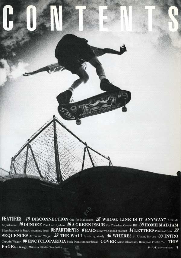 This is deffinatly one of my favorite contents pages I have ever seen. I escpesially love the the main image, its great! It is so simple and plain, the black and white effect helps that, I love the fish eye lense used to distort the image into lookin not so flat and grounded, the low-angled shot makes the reader feel as if the boy of the skateboard has jumped so much higher than he really is, I also really like the possition the person is in, its not in a normal possition you would see someone doing a jump from.
the font gives it an anique, 'olde' appeal about it, it reminds me of write you tend to see on preserved wine bottles, it give it some sophistocation.
The masthead is so simple, it doesnt distract the reader away from the main image of the classic font, yet it's right there and you cant miss it. It gives the overall contents page a base to it.
UPLOAD COLLEG MAGAZINE SKETCHES!!!!!!
NEED TO ULOAD SKETCHES OF COLLEGE MAGAZINE, need to be scanned (:
My College Magazine front cover

This is my magazine front cover.
I especially Like the mast head and the cover lines, but I feel I could have injected more colour in to in, I do like th fonts, they work well with the mastehead, I wanted a grey background beacuse I thought it could work with the urban/retro theme I wanted to show.
I think there should be another image on there also, that way it would look more busier and exciting. I think its good but I can see there is alot more I could have done to make it more appealing to its correct audience.
I would also like to put a massive pull quote on slarnting across the main image, one that has the effect of being 'torn' from a different magazine and stuck down on my cover page, I think that would add great texture and look creative.
I also should have added effects to my main image using photoshop, this is something I need to play around with- I will upload examples. (:
college magazine anaylsis 2

This is the second magazine I analysed to research further what the market is looking for when purchessing a college magazine.
This magazine is called 'College Lifestyle' It seems to be aiming itself at the older student, the main image confirms this, its of a quite a cool looking student, a young black male in his late teens, or he could be older, he's holding a collection of art and history books which shows he's currently in eduction (aiming it at the required audience). He's dressed fairly casually in dark jeans and a black leather jacket, with a white t-shirt. and to add some youth appeal to him they've add a 'hip-hop' crisifix chain. What I like about the main image is that it is over laping the masthead, I might use this on my cover, it helps make it stand of the page and gives it some character.
The colour scheme is also relatively dark, which works well with the main image, it has great splashes of bright green, which are very eyecatching and would catch any youthful eye; its been used within the masthead, main article and sells, the rest of the text is white but it isnt boring because there is a great and varied use of fonts, which keeps the reader drawn in.
Front cover orifinal image

This is the original image for my front cover; I wanted Jessica to look retro, I think this blue and yellow t-shirt work well together and the splashes of re on her t-shirt matcch her red hair, so I might use red on the front cover to attcract the readers attention and too join up the separte parts that make the cover page up.
-This image had been taken as a mid shot; straight on, the lighting was also directly infront which helped to light up jess's features and the image as a whole.
Tuesday, 8 February 2011
Analysis of a college magazine
The magazine I am going to analyse is ‘College’ it’s aimed at students attending either college or university, the main image is of a young girl, a student, and she is positioned in the centre of the magazine as a wide shot. The magazine’s layout is fairly formal this includes the masthead which is in typical college font in bold red lettering which works well with the main image as her t-shirt is red also.
There are articles positioned around the main image, the main points are in bold, black text or italics, whereas the rest of each article is in bold blue, the colours and texts used are relatively formal which helps to display the college theme, but the articles themselves seem fairly relaxed e.g “she’s 15 and pregnant” and “he better hope they serve beer in Hell.” These articles give the magazine a real teenager/adolescent sense.
There aren’t many features of the magazine that grab the readers attention, no bright colours and eye catching images, although this is a college magazine and follows the uniform, I feel it could have been made more eye catching and exciting.
Mario Testino PhotoShots
Mario Testino has done photo shoots for major companies such as, h


Testino is one of todays most well known celebrity photographers. he has had many succesful excibition worldwide and his work has been feature accross globally throughout glossy mags. He help kick of leading fashion companies such as burberry, calvin klein, dolce and gabbana, hugo boss and many, many more.e has photographed some of the most famous and successful icons in our media industry today such as, Emma Watson, Kim Basinger, Kylie Minogue, Tyra Banks, Kate moss, Elizabeth hurley, Lady Gaga, Britney Spears, Catherine Zeta-jones, he also did many successful photoshoots with Princess Diana. He has influenced the fasion industry and promoted celebrities status's through out his shoots.
Testino is one of todays most well known celebrity photographers. he has had many succesful excibition worldwide and his work has been feature accross globally throughout glossy mags. He help kick of leading fashion companies such as burberry, calvin klein, dolce and gabbana, hugo boss and many, many more.e has photographed some of the most famous and successful icons in our media industry today such as, Emma Watson, Kim Basinger, Kylie Minogue, Tyra Banks, Kate moss, Elizabeth hurley, Lady Gaga, Britney Spears, Catherine Zeta-jones, he also did many successful photoshoots with Princess Diana. He has influenced the fasion industry and promoted celebrities status's through out his shoots.
Analysis of amusic magazine
Anaylsis of a Music magazine
The magazine I am going to anaylse is 'The source' the genre of magazine is hip-hop/rap, this is shown by the main image of American rapper 'The Game'. The image has been placed central, his head is covering a fair amounth of the masthead, which is in blood red, just underneath the masthead is the magazines Logo, this has been majorly hidden by the main image also.

The layout of the cover is good, it really grabs the attention from the right audience, some of the ways they used to acheive this was the fonts and colours used for example the most important articles, such as the main article are in blood red and less important ones are in white. The colours work really well with the main image because 'The Game' has a gun pointing up towards his chin, and the main article states- "The Game, suicide is not a option." the gun, the word 'suicide' and the colour red all link together and symobilse the same thing- death.
I really think this magazine has managed to gain the right attention from the attended audience, if i saw this in a shop, althought I am female, I would deffinatly consider bying it.
Subscribe to:
Posts (Atom)