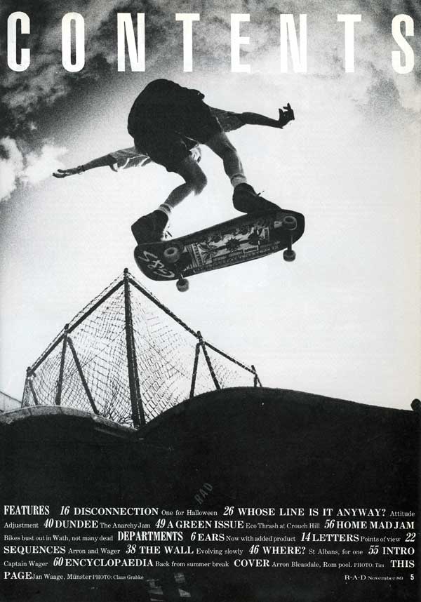
 This is deffinatly one of my favorite contents pages I have ever seen. I escpesially love the the main image, its great! It is so simple and plain, the black and white effect helps that, I love the fish eye lense used to distort the image into lookin not so flat and grounded, the low-angled shot makes the reader feel as if the boy of the skateboard has jumped so much higher than he really is, I also really like the possition the person is in, its not in a normal possition you would see someone doing a jump from.
the font gives it an anique, 'olde' appeal about it, it reminds me of write you tend to see on preserved wine bottles, it give it some sophistocation.
The masthead is so simple, it doesnt distract the reader away from the main image of the classic font, yet it's right there and you cant miss it. It gives the overall contents page a base to it.
No comments:
Post a Comment